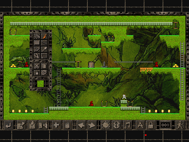
Since one of my goals was to remove the OS specific dialogs, this meant ditching the Windows 3.1 style file menu. Nearly all the actions in this menu are not needed and can be removed or incorporated elsewhere. I did waste several days adding a music and lock button to the editor menu. To keep with my "don't mod the original art" motto, I created a new overlay to go over the original.

Overlay for the editor UI
The original buttons were shuffled along and my nice new MS Paint buttons went into place. I'm somewhat bias, but I quite think they blend in and if you haven't played for a long time, you wouldn't mistake them for being new.

Lock a puzzle was my favourite!

Final result
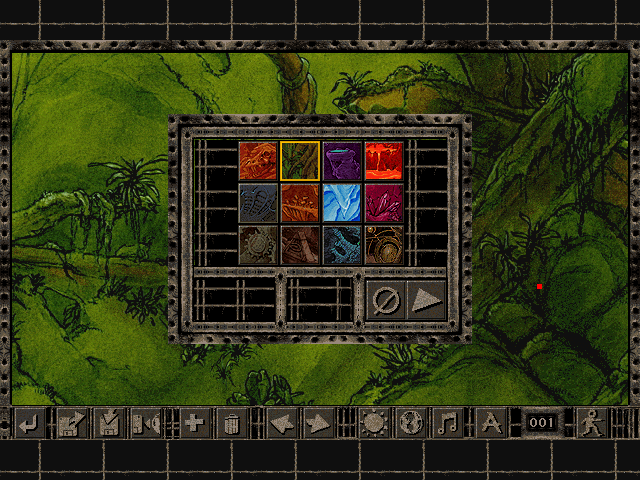
Moving the music from the file menu to a new dialog was a little difficult. Sounds easy on paper, but what will it look like? Something basic? Something with a preview of the audio track? Some way of telling what track went with what world? The end result was pretty much the world preview dialog without the preview part on it. I wasn't very happy with this. It was far too basic, didn't look like it had anything to do with music and I couldn't think of a way to add more content that had a need to be there.

Unfinished music dialog
I spent a week all up on these mods and in the end decided with my brother to ditch them completely. The reason came down to a few questions;
- why allow the option to play Moss Caverns over the industrial world instead of Meltdown Metropolis?
- what is the actual need to lock a puzzle?
We couldn't think of one reason why you'd want to lock a puzzle; if you don't want others to edit the puzzles you've made, then don't share them in the first place.
We also couldn't think of a reason why the editor can't just set the music when it sets the theme. There is no reason for you not to use the correct music with the correct puzzle.

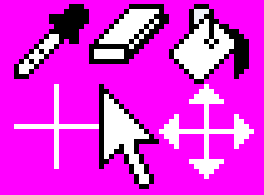
Zoomed in shot of the editor mouse cursors
The only other abandoned idea to date are mouse cursors. The original just used the system cursor which was ditched in favour of a themed one. The editor icons as you can see are just a black and white version of the toolbox tools. Unfortunately, I don't have any shots of these in action but they were removed because they just didn't look right - even though they are ripped from the editor itself, they just looked like they were straight out for the earlier versions of Windows.
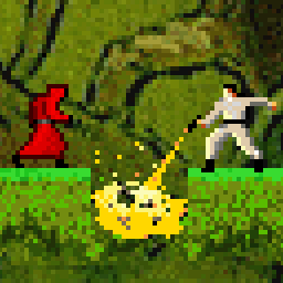
The new cursor is actually the top corner of one of the buttons in the game options dialog. I quite like this cursor. It took a while to get the hang of as being a Windows user, the mouse is always pointing to the left and this one is to the right. The cursor goes orange when clicked.

The current mouse cursor
