We've had many concepts for tweaking existing features and new ideas that didn't make the cut. Here's a few shots of several them.
Tooltips
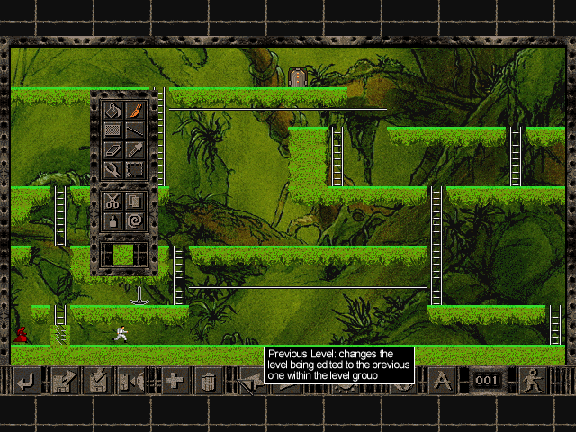
As you can see, not having the bubble Windows 95 style tooltips was a mistake. A big one. They looked terrible.
Prompts

Message box prompts were quite different to what we have today.
Much smaller in size and with text buttons, it was scrapped for that very reason. No other button is text only and no other window has such a thin border (other than the tile palette).
LAN
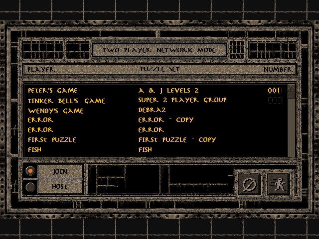
This concept was canned and evolved into the below image. It felt too text heavy and cluttered.
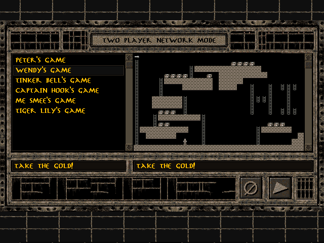
Like above, too cluttered. Adding the puzzle schematic lead to the current, cleaner window we have today.
Music
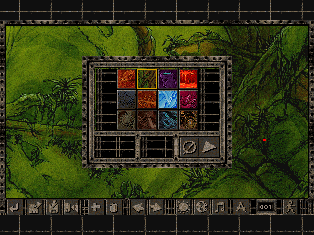
This purposeless looking dialog was to replace the old OS top menu setting of choosing the theme music for each puzzle.
It came with its own music note button on the editor's menu too. We did think about adding an equalizer display but it probably would have looked just as unnecessary.
This was fully working but was removed and eventually replaced with simply right-clicking on the desired world via the existing world background window.
Toolbox
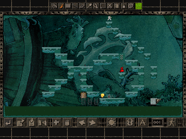
We toyed with the idea of allowing the editor's toolbox to snap out of the way. Handy for windowed mode but mostly useless in fullscreen due to the larger screen real estate. This never moved past MS Paint.
