I might have started this project with the goal of doing a 100% clone but the more I write it, the more I seem to be changing it.
But, fear not, the changes I've made haven't been too obvious or detrimental.
I thought I'd take the time to show what exactly I've changed and why:
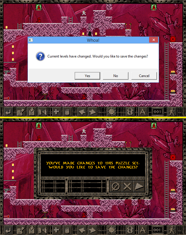
TOP: Original OS message box
BOTTOM: New style (the buttons being backwards was intentional, MMR's other dialogs all have the Cancel & No buttons before the Yes)
WHY: As mentioned in previous posts, I never understood why most dialogs in LR have a custom look whilst the OFD, message boxes, and top menu were left with the OS versions.
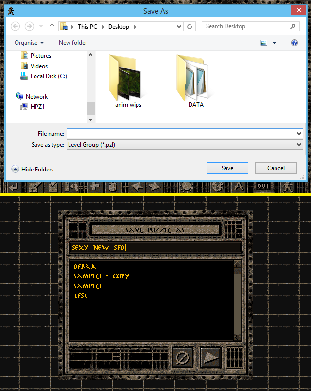
TOP: Original OS save dialog
BOTTOM: New style
WHY: See above comparison - all dialogs are now themed to match the rest.
Ability to change directories has been removed but delete and copy are still present.
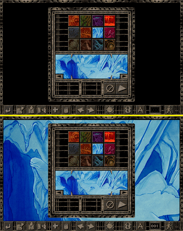
TOP: Original theme preview
BOTTOM: Full sized preview now displayed in the background (puzzle number is also shown)
WHY: Some dialogs in LR have backgrounds and others have just blackness. I wanted to unify them all, which in my opinion, creates a more 'polished' look.
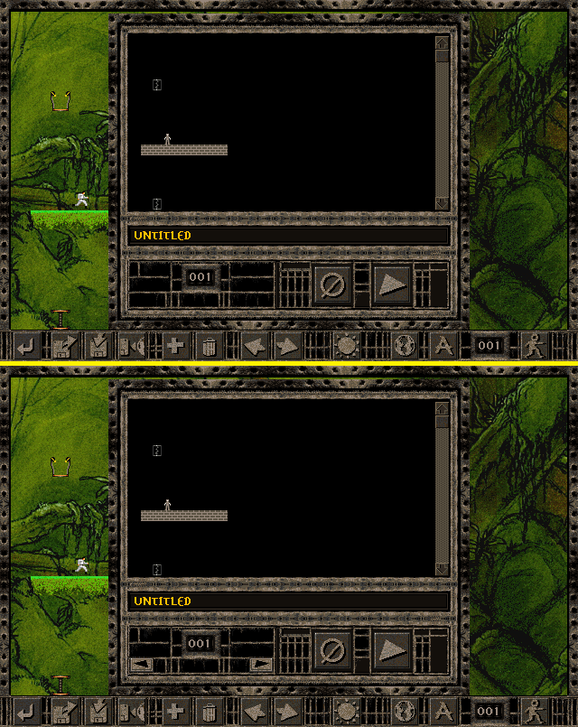
TOP: Original puzzle viewer
BOTTOM: Now has the ability to shuffle the puzzle order
WHY: You always could change the order of puzzles by simply changing what puzzle the exit doors lead to. However, they still aren't shown in chronological order in the viewer which I find quite confusing when editing large sets of puzzles.
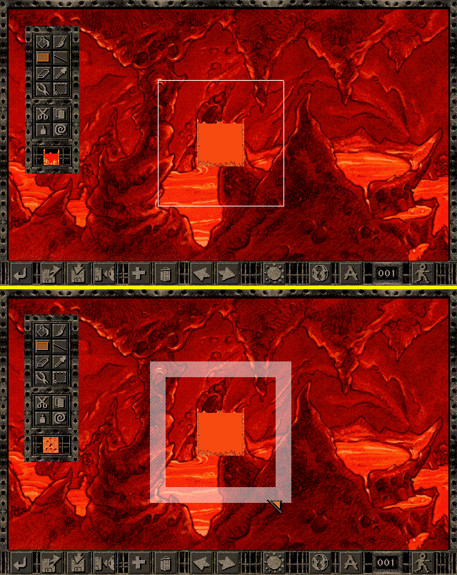
TOP: Original box/line paint tool
BOTTOM: Tools now shows a turf sized line
WHY: Because the original's line is drawn mid-turf, it can be difficult to see where exactly you're about to paint.
Now you've seen the biggest 5 changes I've made, later on I'll share with you all the minor tweaks that have been done so far.
