The more I do on my Mad Monks' Revenge remake, the more I seem to be changing. Don't worry though, the core parts are still the same, nothing to fear there. The parts that I'm changing, apart from the UI and adding new features, are the animations.
All the changes I've made can easily be restored to match the original in a few minutes if later on it turns out some of the original puzzles rely on it that way. Why the need to change these things? As a massive fan and someone who is playing/creating the game every single day for hours at a time that involves looking at videos of said gameplay a frame at a time, some things just don't look right. Take goop and rock debris from a pick-axe landing on a phase block.
ATTENTION DIEHARD FANS! Do you agree with these changes? Pop me an email.

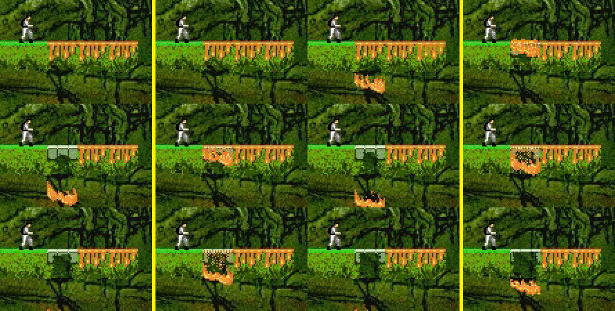
The original goop on the left and the new on the right
If you look at the goop in the original, why is it starting well below the phase whilst the goop is still on the top? And why does the first frame of the phase block fading out look like a goo block? There is nothing really wrong with it, personally, I just don't think it looks correct. I ended up merging goop landing in liquid with the falling version. The end result I think is the appearance of the goop sliding off the surface and dropping downwards.

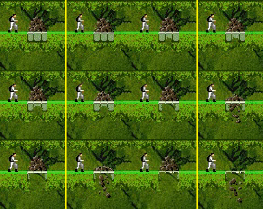
The original debris on the left and the new on the right
The rock fall debris caused by the pick-axe has a slightly different issue. Why is it floating in the air with nothing to support it? Unless the original has David Blaine hiding in the rubble, I think this too is quite odd so I've done the same thing with the debris - merged the fading away animation with the fall one. The end result is the rubble falling through the block and carrying on its way.

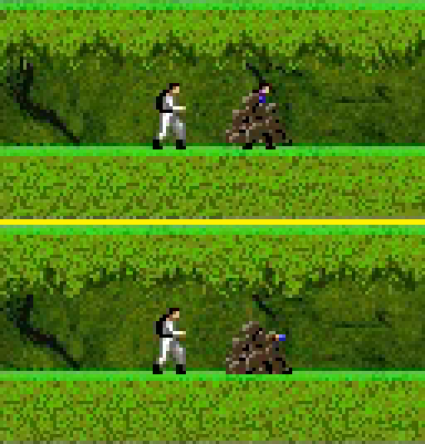
The original on the top and the new on the bottom
Burying a player in rubble was changed too. The original has him somehow stand up and stay in the idle pose all while completely buried under a pile of rocks! I'm not sure how he manages this, probably the same way he can fall metres and metres and not break his legs, but it looks a little silly. The actual animation for the player being buried has a lot of frames in it that aren't used. I have the player buried with his arms over his head.
You'll also notice that the rubble now draws on the ground. The extra one pixel makes all the difference - the original looks like Wes is wearing a dress made of rocks with black boots and stockings or standing in a large pile of excrement.

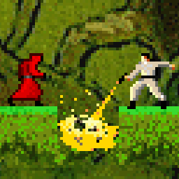
The original debris on the left and the new on the right
The last change to the rubble is ladders. Debris piles will continue to stay on top of a buried ladder but will fall down a normal ladder. Again, it looks odd as the ladder clearly isn't level enough or can support the weight of the rocks.
Thoughts
Overall, I think these small changes not only look much nicer (and matches the existing style and art since no new art was added), but also improves the functionality to remove some of the quite bizarre behaviour of the gloop and rubble. Again, if it turns out some puzzles needed things to be like that to be solved or fans hate them, I can simply put it back to match the original.
