Lode Runner Online: The Mad Monks' Revenge Rewrite project uses a custom user interface - all the user interface elements in the game are made from scratch. We could have used an off-the-shelf solution but, unfortunately, they all appear to attempt to replicate Windows with a myriad of controls and functionality Lode Runner just doesn't need.
The basics are of our UI;
- text box
- label
- button
- image box
- window
The framework allows you to combine any of these basic controls to make more complex ones such as;
- list box
- drop down
- scroll bar
Finally, a window manager handles opening/closing, tooltip display, window ordering, drawing, and updating of all window controls.
The original UI in this project was, to be honest, a little messy. Each control wasn't really designed with the future in mind - only designed for what was needed at the time. The UI was originally going to be copied straight from the last build of our abandoned Captain Yates game but had to be written from scratch when we couldn't find a single copy in 5gb+ of backups.
How it's done
Basically, all the main code lives in the base control (aptly named 'control') which provides basic properties such as;
- position (both relative to parent & position on screen)
- size
- image
- tooltip
- id
- access to content manager, sound class, etc
This control contains everything that all the controls have in common and then other controls can extend and either build upon it to do something more complex.
Events are raised for various actions such as mouse activity that the parent control can respond to.
For example, the button class inherits the base control and overrides the draw function to render the desired image. It also responds to the base mouse press and release and click events to react as required.
The trickier controls are the nested ones (any control with more than one element). These all inherit a 'container' control that simply acts as a dock and allows the creation of more advanced elements. The controls work together to create a new one.
A good example would be the scroll bar which is made up of 4 controls (base, up button, down button, drag widget button).
The parent container simply listens for the mouse press, release, click & move events and then raises an event of its own (OnValueChanged) to allow dialogs or even other controls to respond appropriately (scroll bar within a list box for example).

The base scroll bar:
- Draws the background
- Listens for the up, down, and widget events and updates the position of the widget
- Provides access to the current value
Button 2, 3 and 4 do not actually do anything at all!
The base simply recalculates the value by simply listening for the OnMouseClick or OnMouseMove events.
Textbox
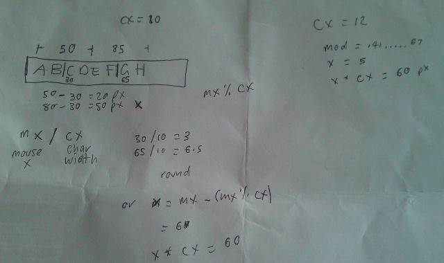
The textbox was probably the hardest control to write. Buffered text entry, inserting and deleting, caret, and only rendering portions of text (scrolling) took many attempts to get right.
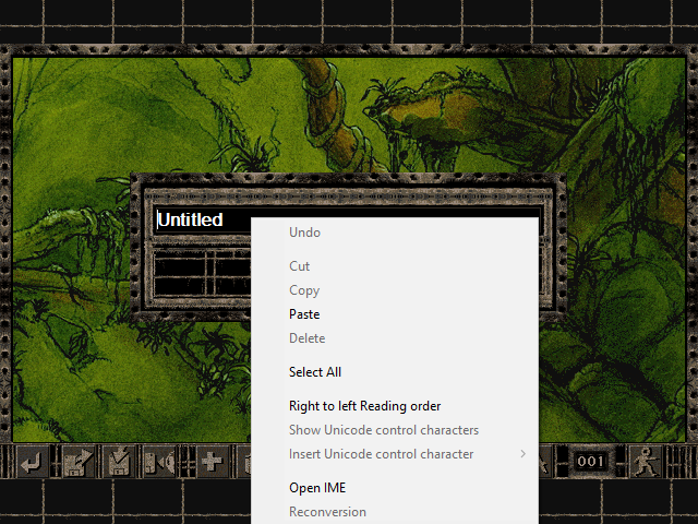
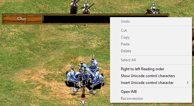
If this game was Windows only, we could have wrapped a Windows textbox. A quick (and not always accurate) way of determining if a game uses a bog-standard Windows textbox is to simply RIGHT+CLICK on it. If you get the context menu below, then the game uses one.

LRO: MMR
Cut, copy and paste is also a part of the control and uses SetClipboardText when copying and GetClipboardText when pasting.
Design tool
To start with, all UI elements were created in code. This process was inefficient and meant a simple thing like altering the position took a lot of print+screening and MS Paint work to make sure controls aligned.
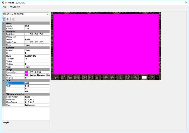
We created a simple tool called "UI-Matcia" to visually (and rapidly) create a dialog from a series of images and export to a simple binary format the game can use (*.UIX). Project files are saved as XML files.


